Brand Guidelines
How it should.
Look. Read. Feel.
The visual brand of The Happy Hustle, written down. Logo, palette, typography, voice, photography, motion. A living reference for everyone who designs, writes, or ships inside the world.
- Display font
- Anton
- Body font
- Instrument
- Core hue
- Ember
- Mark
- Smiley
The brand at a glance
A practice, not a personality.
Ambition without the burnout.

Three pieces hold this brand together: a single-weight display font, a palette built around a warm near-black, and a smiley mark that earns its place by never being where it isn’t needed.
02 — Logo & lockups
The mark.
And how to leave it alone.
Primary lockupThe smiley mark
The smiley is the brand. The wink, the X-mark, the small imperfect grin — it is the only mark that carries the name on its own. Use it large and proud, or small and quiet. Never rebuilt, never re-traced, never replaced with an emoji.
- File
- /hh/logo-smiley.png
- Mark only
- /hh/logo-white.png
- Minimum size
- 28px (screen)
- Clear space
- 1 × H height
HustleWordmark
The wordmark
When the smiley can’t breathe, the wordmark stands in for it. Always set in Anton, always uppercase, always at a tight negative tracking. Two lines stacked is the canonical arrangement; a single-line variant is permitted on banners wider than 5:1.
Clear space
Reserve a margin equal to the cap height of one “H” from the wordmark on all four sides. Nothing lives inside that boundary — no text, no rule, no edge of an adjacent image. The mark needs to breathe.
Approved colorways
Don’ts
Four things never happen to the mark. The animation may tilt during arrival, but the logo must settle at zero rotation.
03 — The palette
Six families.
One thesis.
Every color tokenized in app/globals.css under @theme. Reference colors by Tailwind class only — never inline hex.
— The base
Ink
The default page surface. Every other color in the system breathes against ink — never pure black, always a warm near-black with depth.
#000000
--color-ink
bg-ink · text-ink
#000000
--color-ink-deep
bg-ink-deep · text-ink-deep
#000000
--color-ink-soft
bg-ink-soft · text-ink-soft
— The recede
Ash
Used to step back. Borders, secondary surfaces, dividers. Never the primary background — ash holds shape without demanding attention.
#2A2722
--color-ash
bg-ash · text-ash
#3B3630
--color-ash-light
bg-ash-light · text-ash-light
— The warmth
Bone
The reading layer — body copy, primary white surfaces, contrast text on ink. Cream, not paper. Bone-muted and bone-dim handle subordinate body.
#EDE6D3
--color-bone
bg-bone · text-white
#B5AC98
--color-bone-muted
bg-bone-muted · text-bone-muted
#7A7365
--color-bone-dim
bg-bone-dim · text-bone-dim
— The alarm
Ember
The primary accent. Used for emphasis, primary CTAs, ornamental punctuation. One ember per viewport — when it shows up, it should mean something.
#BA0505
--color-ember
bg-ember · text-ember
#7A0404
--color-ember-deep
bg-ember-deep · text-ember-deep
— The rest
Patina
A weathered green, drawn from old canvas and gunmetal. The brand's only chromatic neutral. Use for editorial accents — dot markers, illustration fills.
#4F5B4A
--color-patina
bg-patina · text-patina
— The smile
Sun
The smiley-face yellow from the brand mark. Reserved for small accent details — never the dominant color. If ember is the alarm, sun is the wink.
#FFD632
--color-sun
bg-sun · text-sun
#C6A41B
--color-sun-deep
bg-sun-deep · text-sun-deep
04 — Typography
Two fonts.
No exceptions.
Display
Anton
Single weight. Always uppercase (enforced in globals.css). Never italicized — Anton has no italic and synthesized obliques look broken. Tight tracking at -0.035em.
- Weight
- 400
- Tracking
- -0.035em
- Case
- UPPERCASE
- Token
- --font-display
Happy
Hustle
Body
Instrument Sans
The reading layer. Mixed case, comfortable leading, OpenType features ss01 and cv11enabled globally. Italics permitted — this is the only place they live.
- Family
- Instrument Sans
- Line height
- 1.65 – 1.80
- OT features
- ss01, cv11
- Token
- --font-sans
The app folded. The team left. Instead of a pivot, he bought a one-way ticket to Thailand. Nine months of nothing — monks, martial arts, and a notebook — became the raw material for a thesis: ambition does not require self-destruction. You can build what you want without trading your life for it.
Body italics are reserved for short emphasis inside a paragraph. Never used on quotes, never on captions, never on labels.
Label
The rule
Section eyebrows always lead with a .rule hairline plus a .label. Letter-spaced at 0.22em, 11px, weight 500. Ember-tinted when introducing a section.
The arc
Coordinates
Episode 312
Type scale
Pairings
Title
clamp(2rem, 5vw, 4rem)
Subtitle
clamp(1.25rem, 2.5vw, 2rem)
Body
1rem (md: 1.125rem)
Label
0.6875rem · 0.22em tracking
Do · Don’t
Type behavior
Do
Field tested
Display uppercase. Tight tracking. Tight leading. Anton at weight 400 only.
Don’t
field tested
Lowercase or wide-tracked display. Looks broken — globals.css will silently force uppercase anyway.
Do
Body in Instrument Sans, leading 1.7–1.8, slightly muted color for long-form reading.
Don’t
Body in Instrument Sans set tight. Leading collapses, reading rhythm dies, and the page feels airless.
05 — Voice & tone
Declarative.
Direct. Slightly outdoors.
We write the way Cary speaks — like a friend who’s also right. Short sentences. Verbs first. No KPI language, no hashtags, no exclamation points. We say the why, not the gate.
Direct
Verbs first. Sentences end early.
Anti-burnout
We never glorify the grind.
Slightly outdoors
Mountain, ranch, ocean — never office.
Quietly spiritual
We sit. We breathe. We don't preach.
Say this
Ambition does not require self-destruction.
Not this
Push harder, optimize relentlessly, never quit.
Why
We never glorify the grind. The whole brand is built on refusing that trade.
Say this
Half field trip, half board meeting, all soul.
Not this
Premium experiential learning event for high-net-worth founders.
Why
We name what something feels like before we name what it is.
Say this
If you hate Wednesdays, none of this matters.
Not this
Improve your weekly engagement metrics across the work week.
Why
We speak like a friend who's also right. No KPI language.
Say this
The circle is small on purpose.
Not this
Exclusive, members-only, by-invitation-only access.
Why
We say the why, not the gate.
06 — Photography
Real shots.
No stock. No AI.
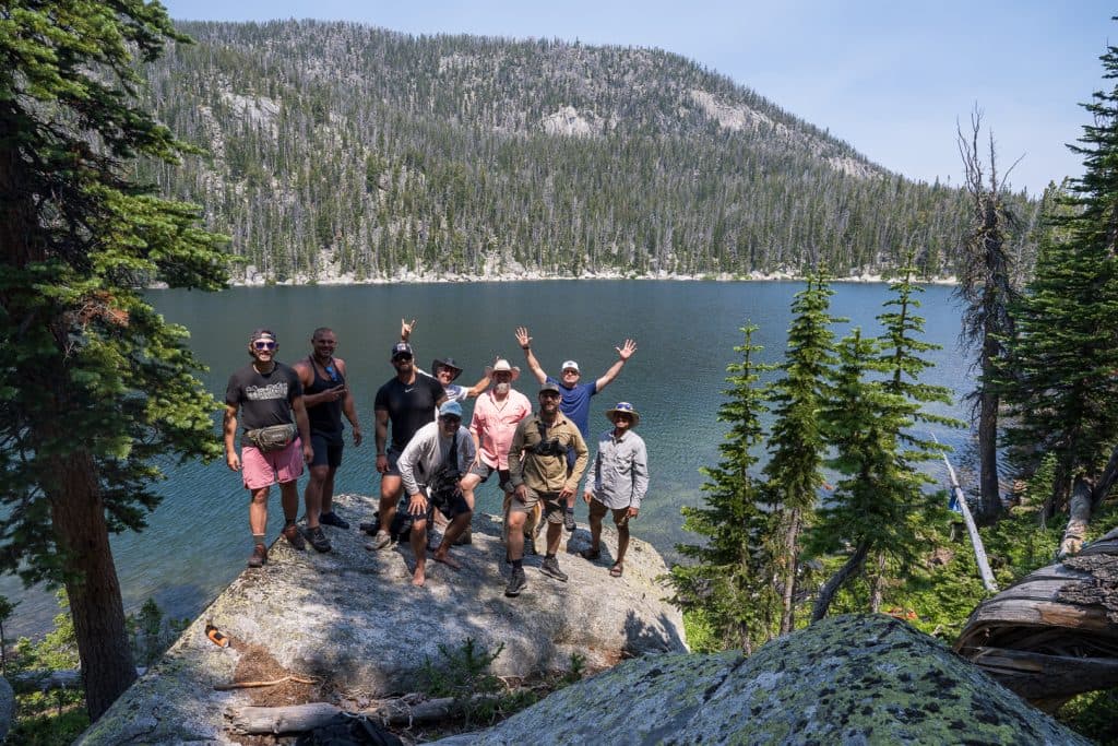
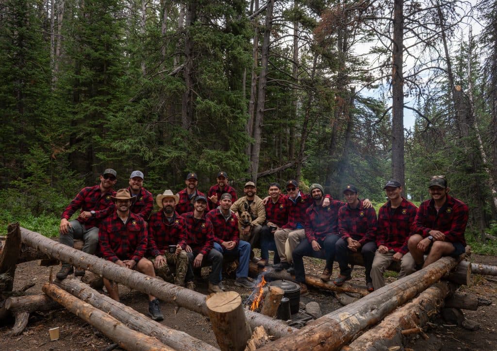
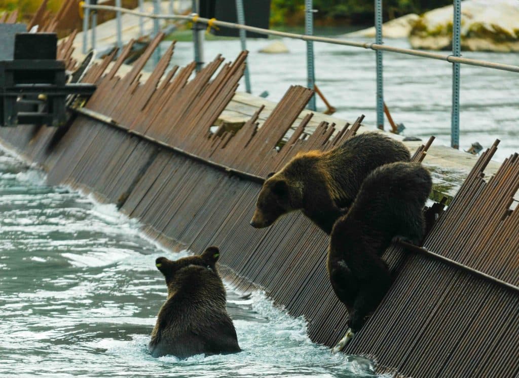
Every image on the site was either scraped from thehappyhustle.comor captured on a real shoot. No stock libraries. No AI-generated imagery. When in doubt, leave the space empty — the brand can carry white space, it cannot carry a Shutterstock founder.
Filter
.image-grade
saturate(0.82)
contrast(1.05)
brightness(0.92)
Applied via globals.css to any img inside an .image-grade wrapper.
Crop
4:5 portrait / 16:9 wide
Portraits and editorial figures use 4:5. Landscapes and cinematic backgrounds use 16:9 or wider. Square is reserved for the assessment radar and dashboard tiles.
Mood
Earned, not staged
Light low. Tonality warm. Faces unposed. We show people doing the thing, not facing the camera with a brand-perfect smile.
07 — Motion
Quiet on entrance.
Loud on impact.
Entrances
<Reveal>
Wrap any block with blur-to-focus and y-translate on scroll-into-view. Fires once.
Easing
[0.16, 0.88, 0.22, 1]
Cubic bezier for arrival. Sharp acceleration, soft settle. Used across hero stamps and headline rises.
Parallax
speed ≤ 0.4
Background layers shift at less than 40% of scroll speed. Anything faster reads as broken.
Reduced motion
Honored everywhere
useReducedMotion gates every parallax + entrance animation. Reveal collapses to static when set.
One exception
The seal stamp
The smiley logo can land at the end of a hero title as a “seal.” It rotates during descent from -32° to 0°, scaling from 1.95 to 1. It always settles at zero rotation. The brand mark must never come to rest at a tilt — see @keyframes stamp-seal in globals.css.
Looking for the code?
This page is the why.
The design system is the how.
Tokens, components, code samples, props — everything a developer needs to ship something on-brand lives one route over.